In another thread I asked:
Any reason more of the interface elements (menus, boxes, etc.) in the Edit window (at least) aren't more Aqua-looking/behaving, like in this KavaMovies screenshot?
And Conor's response was:
It allows us to be more flexible, show more information in less space and allow the customization of the field order and tab location.
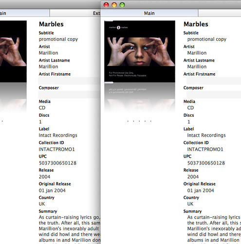
I still don't understand why the fields couldn't look more like this (Dvd Hunter's Info window):

The fields/values are clearly more distinctive than in DVDpedia:

Also, Dvd Hunter's buttons and navigation tabs look nicer (and more familiar) to me.
DVDpedia is the superior app for me as far as functionality and performance but it might consider borrowing some appearance tips from at least Dvd Hunter and KavaMovies (just two apps that happened to be convenient for comparison).