Report your bugs here - if someone else has already mentioned the same bug, just add on to their post with as much info as possible to make the hunting easier.
I just noticed in DVDpedia, that the font size for the count number is smaller than in Bookpedia, even when Collections Text is set to "Large" in both apps.
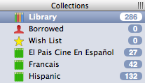
Please see this image:
In DVDpedia, two and three-digit numbers are still quite small, whereas in Bookpedia they are larger. Both apps are 4.5.4 and I'm on Snow Leopard 10.6.2.
While it doesn't explain the size differences between the 'pedias you've noticed, back in April I mentioned DVDpedia's small, hard-to-read item count badge to Conor in e-mail:
When setting the Collection Text set to Large the entries count remains too small to comfortably read on my wife's eMac monitor.
His response:
This is actually the fault of how I set up the code to decide the size needed for the bubble. It does it based on the number of entries in the Library collection (I assumed this one would always have the most, 99% of the time it's correct). When you have an excluded collection with more entries than the Library then the numbers are quite small. This was a bug I was aware of when writing the code, I didn't want to take the penalty speed slowdown of looking for the largest number in any collection when calculating the size. But it might be time I get in there and fix that.
Normally I'll ask before publicly sharing any private correspondence but this is one of those "it's easier to ask forgiveness than it is to get permission" exceptions.
That might explain it, but the Library collection is the largest number in DVDpedia and I don't have any excluded collections there -- only smart collections. Strange too that there's a difference between Bookpedia and DVDpedia. It's certainly not a big deal but, as you say, it's a bit difficult to read.
I've accepted that item count badges will remain sometimes tough for me to read in many apps, not only DVDpedia. The numbers tend to look too "fat" and don't have a crisp enough contrast with the background color.
The "16" for the "Crime" collection in your DVDpedia image is particularly blurry, though actually readable without trouble for the "3 - Limbo" Bookpedia collection.
I added a bunch of DVDs to my collection yesterday and shut down DVDpedia. When I started it up this morning, the numbers displayed like they do in Bookpedia. I now have 137 movies in the library.
Why would the font size need to differ based on the number of items in a collection? Mail.app uses the same size font whether a mailbox has 5, 25, 725, or 10000 unread messages. Higher numbers should only make the bubble wider - I don't see why it should affect the bubble's height and font size.
marumari wrote:Why would the font size need to differ based on the number of items in a collection? Mail.app uses the same size font whether a mailbox has 5, 25, 725, or 10000 unread messages. Higher numbers should only make the bubble wider - I don't see why it should affect the bubble's height and font size.
Yes, that's what I mean -- the bubble size. If you look at the screen shot in the first post, you'll notice that the bubble size doesn't change and that the numbers actually get smaller to accommodate a uniform bubble size. Now that I have more than 100 movies in the library, however, the bubble size has changed appropriately, whereas before it had not.
I have fixed the minimum size of the column for the next version, making the count appear sharp and readable no matter what the total number of items in the library collection is. It's not in a recent beta as I am also working on other unfinished changes.